3D bar charts and graphs may work against you. I’m at O’Reilly Strata to learn about big data. Of the many fabulous presentations this afternoon, I chose Naomi Robbins‘s "Communicating Data Clearly". Robbins is an expert on graphical data presentation. And she’s got some vivid examples of where using graphics to convey data can go really wrong — or really right.
"Effective is not the same as beautiful," says Robbins. She showed several examples of gorgeous graphs that do little more than confuse the audience. Of all her examples, one stand out came from the ubiquitous 3D bar charts we tend to see in business presentations.
You know how it goes. You’re pulling together a report and you want to jazz it up with some pictures, make it speak to people a little more. So you generate a pretty bar chart.
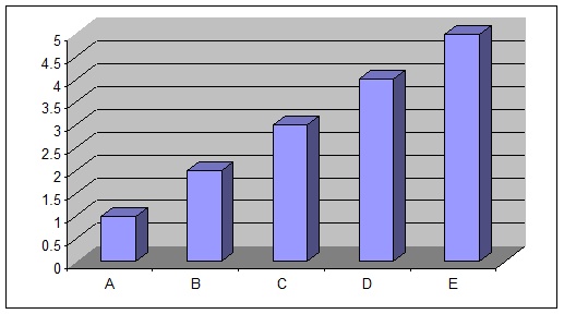
Take a good look at the chart. Now do me a favour, will ya? Tell me the values for A, B, C, D and E.
This is just what Robbins asked people at the conference to do. I’ve created my own chart here, but the idea and the exercise are hers.
Then look at this chart. Again, this is my chart, but it’s Robbins’s concept. She asked us if we could tell the values for the 2D bar chart below.
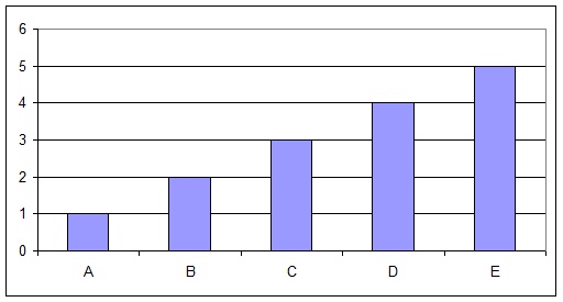
As she noted, a chart like this one is pretty clear. Now, having seen the two charts, which set of data do you trust? Robbins encourages us to think it over.
It’s the same data!
Robbins noted that the 3D bar chart (from Excel, but similar problems pop up in other programs) don’t touch the wall and thus the lines and bars are off.
"Don’t use 3d bar charts — I don’t care what software you use!" says Robbins.
Robbis has many other examples of good and bad chart usage. You can pick up her book Creating More Effective Graphs:
Howdy! I simply wish to give you a big thumbs up for the excellent info you’ve got here on this post. I am coming back to your site for more soon. – See more at: http://www.sqiar.com/
Howdy! I simply wish to give you a big thumbs up for the excellent info you’ve got here on this post. I am coming back to your site for more soon. – See more at: http://www.sqiar.com/
Howdy! I simply wish to give you a big thumbs up for the excellent info you’ve got here on this post. I am coming back to your site for more soon. – See more at: http://www.sqiar.com/
Howdy! I simply wish to give you a big thumbs up for the excellent info you’ve got here on this post. I am coming back to your site for more soon. – See more at: http://www.sqiar.com/
Howdy! I simply wish to give you a big thumbs up for the excellent info you’ve got here on this post. I am coming back to your site for more soon. – See more at: http://www.sqiar.com/
Howdy! I simply wish to give you a big thumbs up for the excellent info you’ve got here on this post. I am coming back to your site for more soon. – See more at: http://www.sqiar.com/
Howdy! I simply wish to give you a big thumbs up for the excellent info you’ve got here on this post. I am coming back to your site for more soon. – See more at: http://www.sqiar.com/
Howdy! I simply wish to give you a big thumbs up for the excellent info you’ve got here on this post. I am coming back to your site for more soon. – See more at: http://www.sqiar.com/
Howdy! I simply wish to give you a big thumbs up for the excellent info you’ve got here on this post. I am coming back to your site for more soon. – See more at: http://www.sqiar.com/